Share:
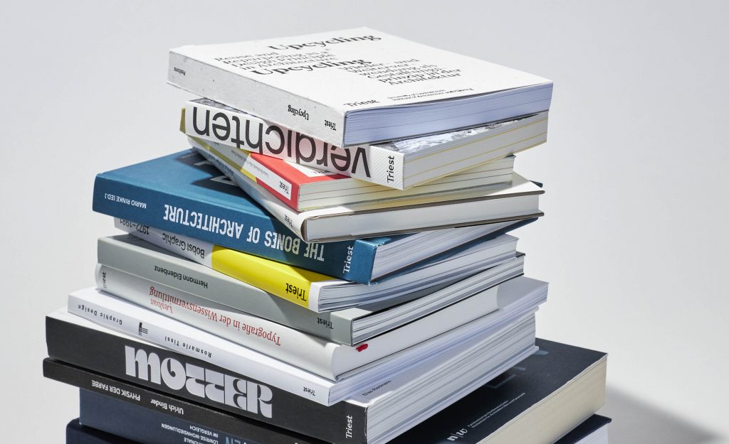
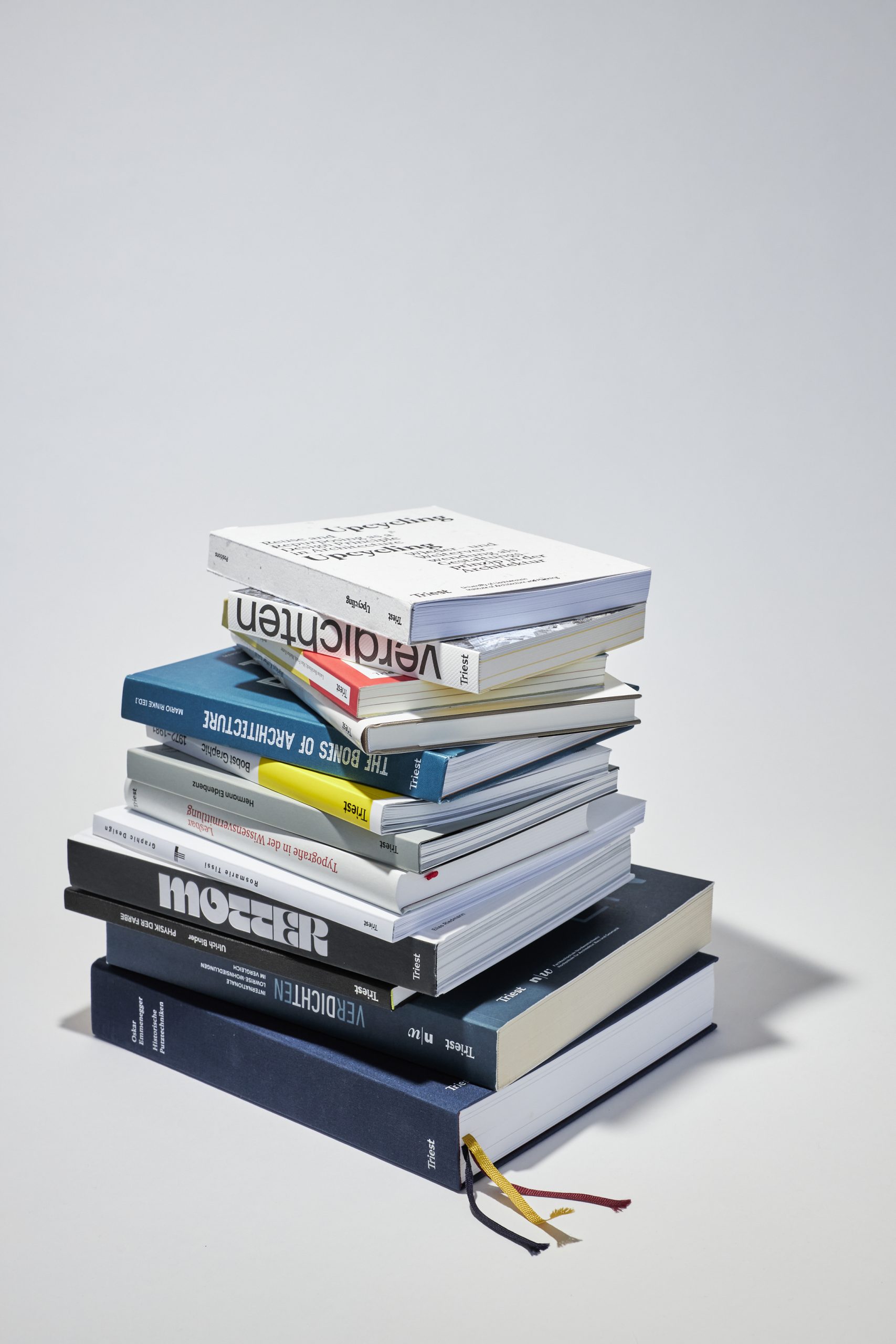
Triest Verlag für Architektur, Design und Typografie are a Swiss independent publisher producing specialist design books in the realms of typography, graphic design and architecture. Their books provide valuable insights and the print production is of exceptional quality. I interviewed the founders, to find out more about their books.
Triest Verlag für Architektur, Design und Typografie was founded in 2015 by Andrea Wiegelmann and Kerstin Forster. We got to know each other working at another publishing house and following its restructuring, we decided to pursue our program ideas ourselves.
Both of us have years of experience in various positions at different publishing houses in the art, design and architecture book sector – Andrea is an architect and journalist, Kerstin is an editor and project manager in the field of design and typography.
In the field of architecture, we focus on topics such as construction, materials research and development, re-use and refurbishment, urban planning, spatial planning and typologies, especially housing typologies. In the design and typography program, we rely on teaching materials for visual design on the one hand and on an in-depth examination of graphic design (with a focus on Swiss graphic design) and design research on the other.
Triest stands for exclusive and beautifully designed books for professionals and specialists. We cater to the highest quality standards, producing special editions crafted specifically for well-informed people who are often experts in their field. In the various areas of our program, we accompany focal topics with a program of events geared to specific titles, with the aim of discussing the subject matter of our books and program with our readers and a broader audience.

Thanks for the compliment! Well, for each book project, we – together with the authors and editors – we look for graphic designers who can develop an appropriate form, a «vessel», for each content.
Finding the right format and specification is often a lengthy process, but the feedback on the print quality and wonderful design of our books shows us that specialist books can, or should, not only be of high quality in terms of content, but also in terms of design and production.
In my opinion, e-books are not a good option when it comes to well-designed books with a high text-to-image ratio. Until today, the hardware we use, that is, smartphones, laptops, etc. is not able to transport the physical qualities of such publications. Besides, the layout of the book mirrors its format, the size of its pages and the content. Text, images, spatial order, everything reflects those physical dimensions. Understanding and anticipating content requires this specific physical experience. A digital version lacks those physical qualities, and as a consequence, also a deeper understanding of the subject matter. Our brain works three-dimensionally, and even today, a digital version is not able to respond to that fact.
Moreover, we think it is important to publish content that is compiled and generated originally for each topic. Often, our books are based on research projects, while sometimes, like Pisé – Rammed Earth, they are research projects in their own right. For that reason, you will rarely find the information provided by our books on the internet. Our topics do not follow short-term trends; our books are of lasting value – a careful examination of the content, identifying connections across issues and a focus on not only currently but future relevance, that is what distinguishes working on a book from quickly provided information in blogs or image-heavy networks.

To come back to a more general level: design books have always been around, but what is certainly new is that in other areas, such as fiction, more value is being placed on good design. However, the option of printing on demand or having small print runs digitally produced is definitely an advantage for small niche publishers, and thus ensures bibliodiversity. Talking of bibliodiversity: ever since 2017, Triest Verlag has been a member of SWIPS – Swiss Independent Publishers, an organization of currently 28 independent German-speaking Swiss publishers who together organize events, lobbying and marketing campaigns.
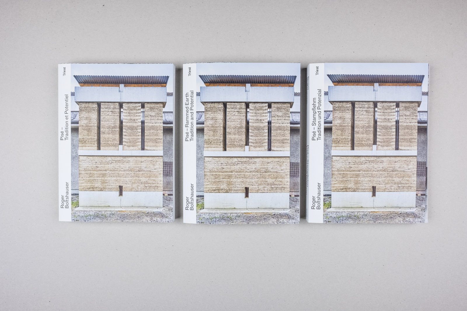
Since our founding seven years ago, we have published a little more than 40 different titles, a good half of them in several language editions, some already in the 2nd edition. Overall, the three editions of Pisé – Rammed Earth, edited by Roger Boltshauser, Cyril Veillon and Nadja Maillard were the most successful. They were published in German, French and English, first as a softcover, with the second edition as a hardcover.
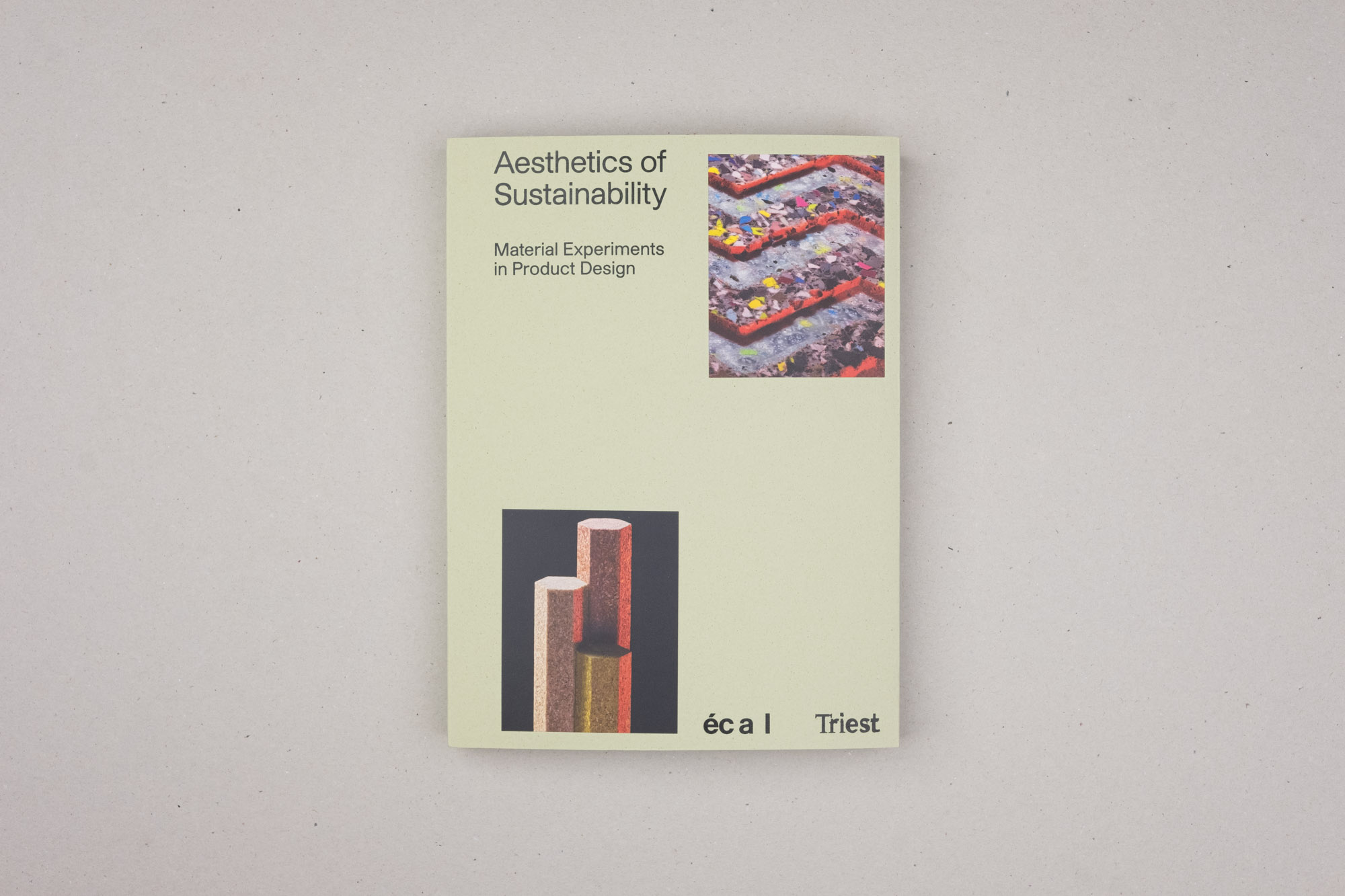
Rammed earth is a rediscovery in the field of sustainable building. However, our other publications in the field of wood construction, upcycling and sustainable product design are also successful – they deliver valuable input to relevant questions we need to deal with in architecture and design today.

Well, we publish a preview of our upcoming titles twice a year that can also be pre-ordered in our web shop. An important title this spring will be “Das Medium Bilderbuch”, a book by Hans ten Doornkaat, who views picture books from a new perspective: text-to-image ratio, specifications, graphic design and typography, reading directions, technical requirements and many more.
In our architectural program, we are working on a title in the field of urban and regional planning and on a project examining residential housing realized between 1945 and 1975, the period in which most dwellings we live in today were built.
