Posters for the Shell Service Stations by Frank Eidlitz

Members Content

Arrows of Advertising – An Australian Shell Poster Campaign designed by Frank Eidlitz

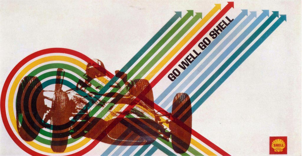
A total of 24 posters were created for the campaign during 1964, using the arrow symbol as a key features, representing power, motion and speed. The handmade lithographs use up to 19 colours, which were individually printed at large scale. The posters also utilise the brand colours red and yellow from Shells corporate identity.

Share:

Members Content

This is a members-only article, gain access and support the archive for £1.99 a month.
Memberships help grow the design collection and share research on the history of graphic design.

You can sign up here.

Already a member?

Sign in below

More graphic design history articles

Members Content

Joseph Binder established his studio, Wiener Graphik, in Vienna. One of the first clients was the City of Vienna’s Music and Theater Festival, followed by many other posters and logos for clients in Austria and beyond.

Members Content

Ezio Bonini's work for "Società del Linoleum" in Milan, showcasing advertisements designed for various Italian newspapers aimed at expanding the linoleum market

Members Content

Wolfgang Bäumer's advertising design for Bayer, Klöckner Works and the Lottery. His adaptable design aesthetic alongside his skills of convening messaging through visuals are fantastic examples of mid-century German graphic design.

Members Content

Bäumer gave the company a unique brand image amplifying its graphical image after a time of post-war economic recovery. This style of advertising composition can be seen across many 1960s campaigns, especially from other German designers such as Anton Stankowski.